How to open Branding
- Sign in to your account dashboard.
- In the top‑right corner, click the gear icon.
- Choose System Settings from the menu.
- Choose the Appearance Settings tab.
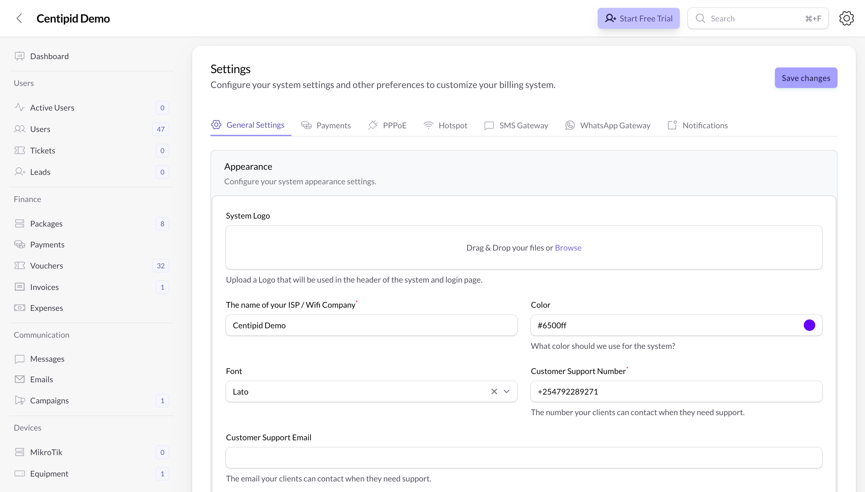
Branding
System logo
Upload your System Logo.- This logo appears in the header of the dashboard and on the login page / captive portal.
- Use a clear PNG or SVG with a transparent background where possible.
- For best results, use a wide, horizontal version of your logo rather than a very tall one.
ISP / Wi‑Fi company name
The name of your ISP / WiFi company is the main label customers will see.- Shown in the dashboard header and on captive portals.
- May appear in emails, invoices and other communication.
- Use the name you want customers to recognise and trust (for example “Your Account WIFI”).
Brand color
The Color field controls your primary brand color inside your account.- Used across the entire system – important buttons (for example Save changes), graphs/charts, and some headings or text.
- Choose a color that matches your brand but still has good contrast on both dark and light backgrounds.
- You can click the color swatch to open a color picker or paste a hex code (for example
#008c4d).
Font
The Font dropdown lets you choose the main font used across the dashboard.- Pick a font that is easy to read at small sizes.
- Changing the font updates headings, labels and most text in the app.
Customer support email
Customer Support Email is where your customers can reach you when they need help.- This email can be shown on the captive portal and other support areas.
- Use a mailbox that is monitored regularly (for example
support@yourisp.com).
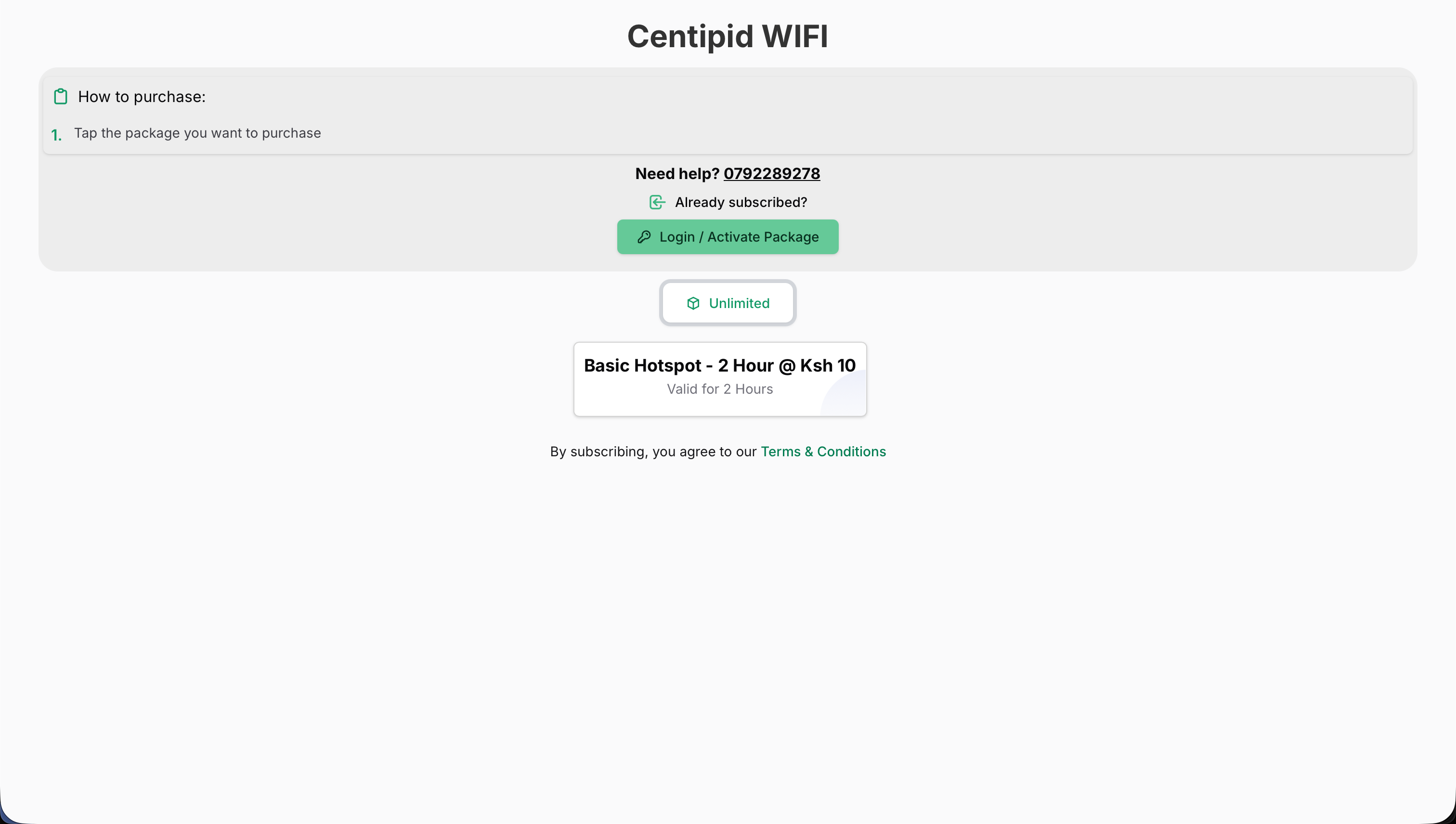
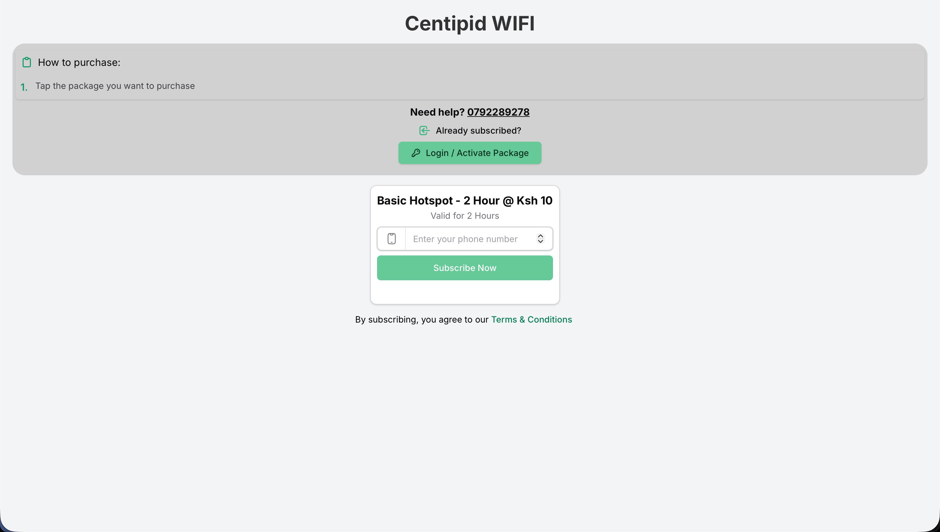
Customer support number
Customer Support Number is the phone or WhatsApp number your clients should call or message.- Shown under Need help? sections in the portal and possibly SMS/WhatsApp templates.
- Enter the number in the format your customers are used to dialing.
Hotspot username prefix
Define the Username Prefix to control how Centipid generates hotspot logins (for exampleMYISP → MYISP001, MYISP002, etc.).
- Located in the same Appearance / Hotspot settings panel.
- Up to five characters; letters and digits only, no spaces or punctuation.
- Helps staff instantly recognise which network issued a voucher or hotspot credential.
- Changing the prefix only affects newly generated accounts—existing usernames stay untouched.
Redirect URL
The Redirect URL decides where customers land after a successful purchase.- Must be an HTTPS link (for example
https://portal.yourisp.com/welcome). - Great for upselling routers, showcasing support contacts, or nudging users toward referral programs or WhatsApp communities.
- Leave it blank to keep users on the default success screen; add your own URL when you want to track conversions, display ads, or drop users into a survey.
Hotspot background
If you pick the Default or Simple template you can upload a custom hotspot background image.- Use it for in-venue advertisements, sponsor banners, or to match your brand’s photography.
- Ideal dimensions: widescreen (16:9) PNG or JPEG under 1 MB.
- Swap it any time to refresh seasonal campaigns without touching code.
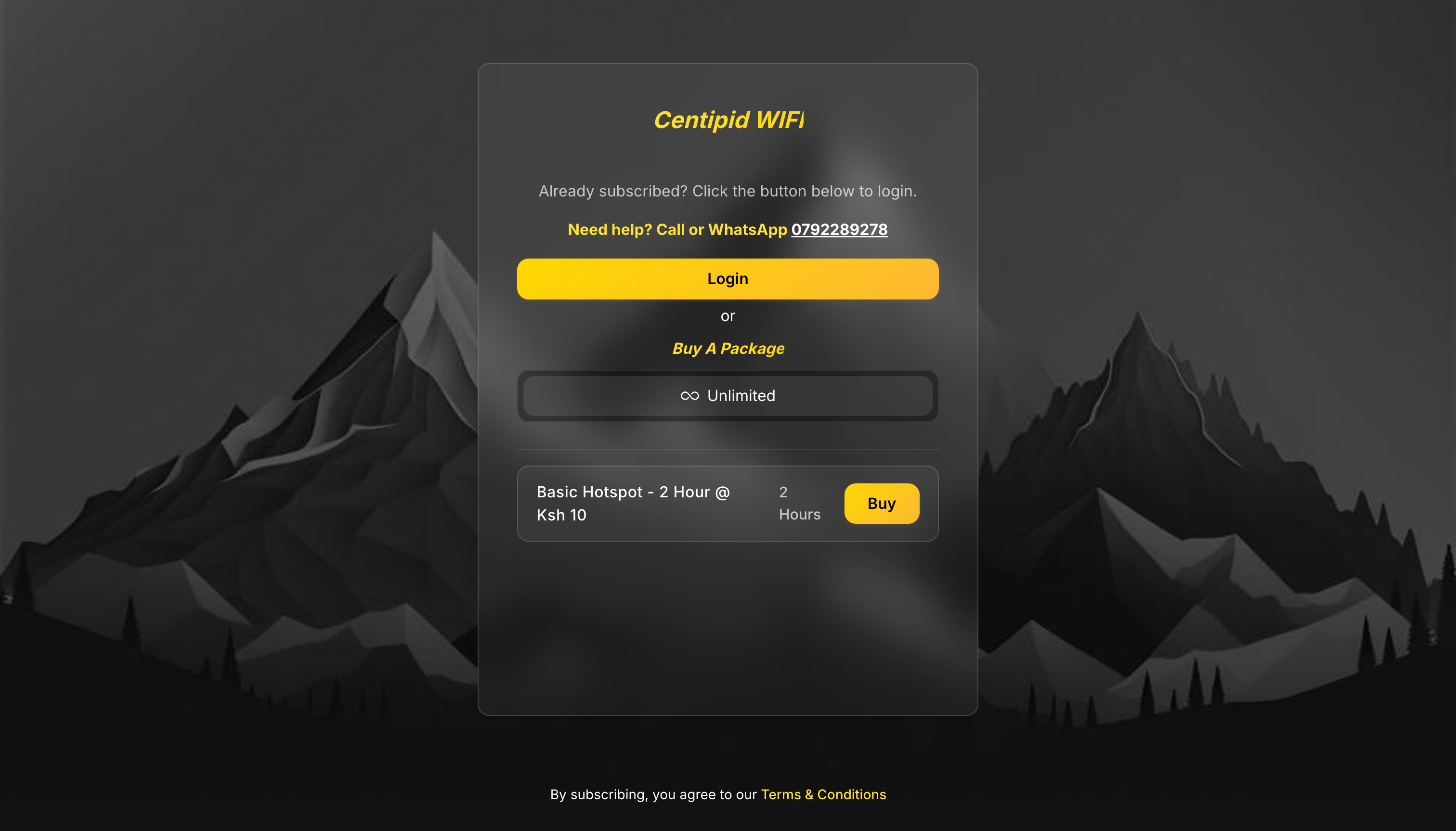
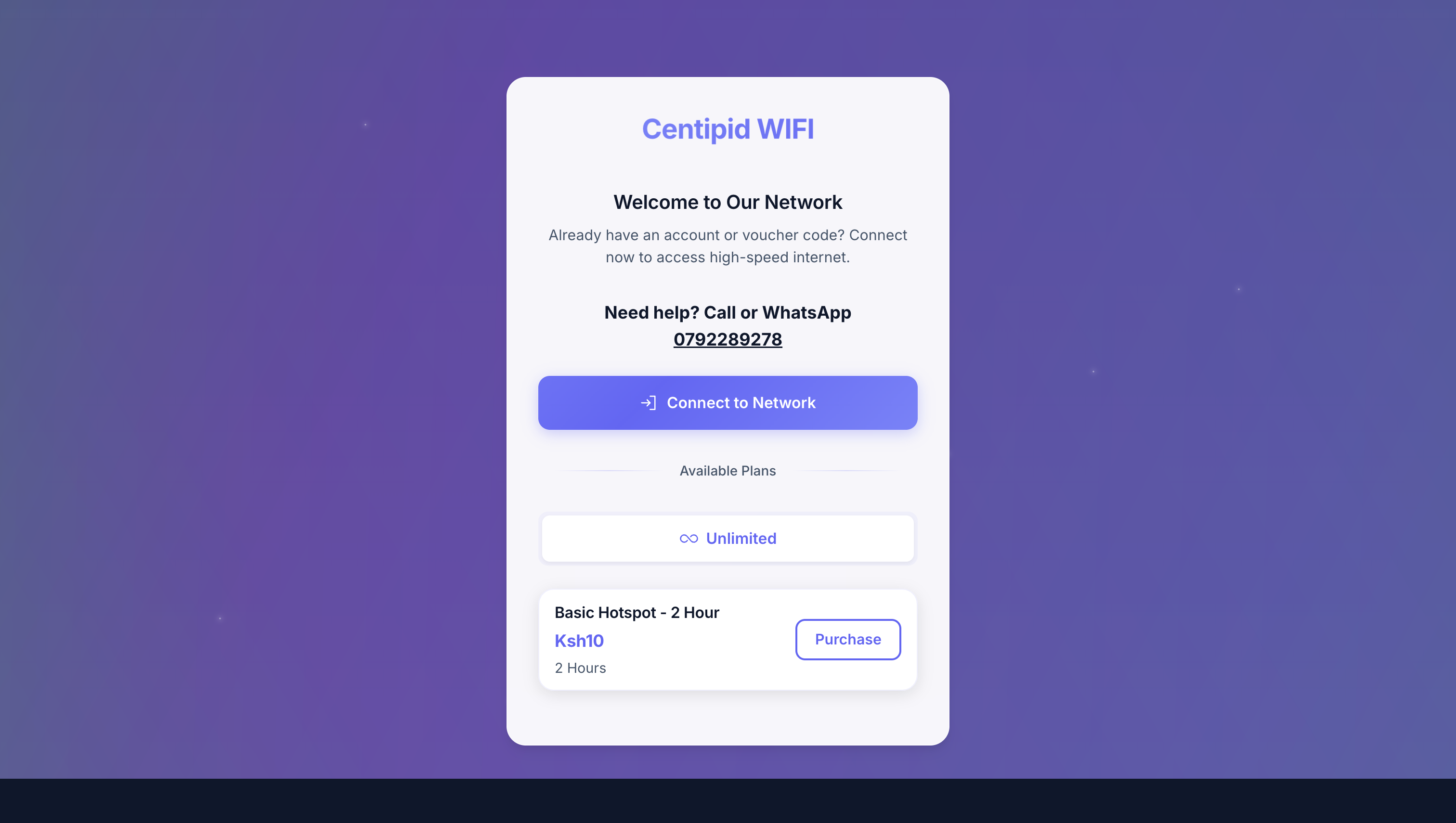
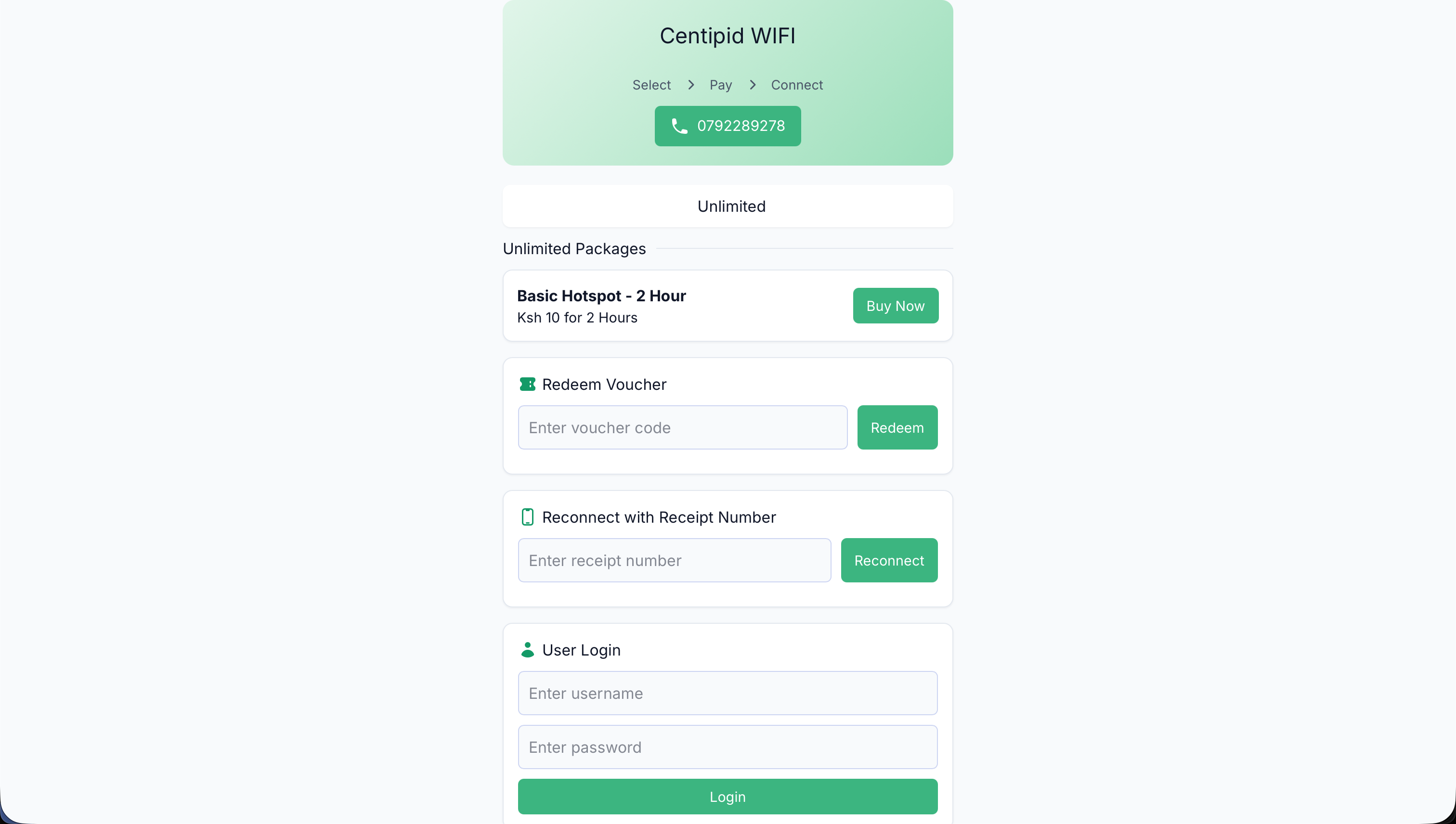
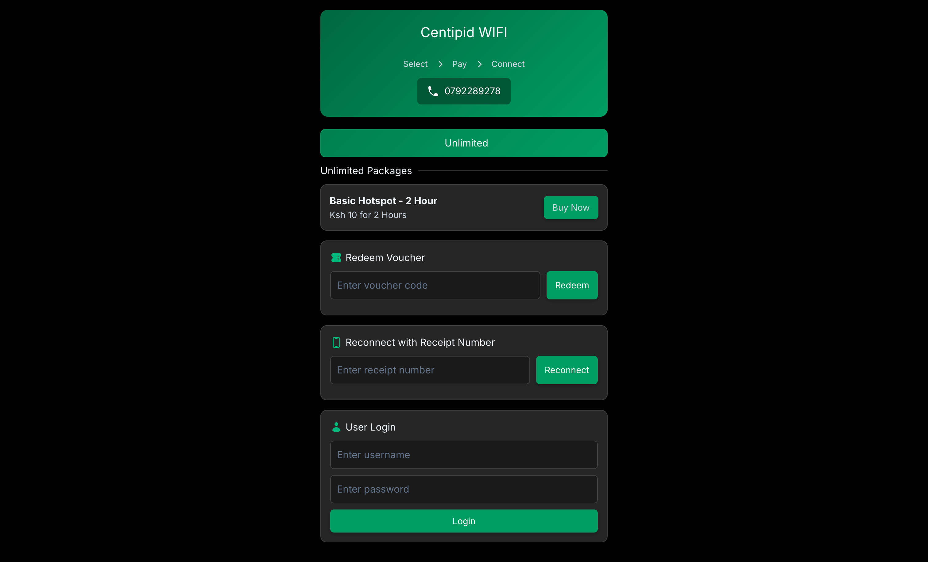
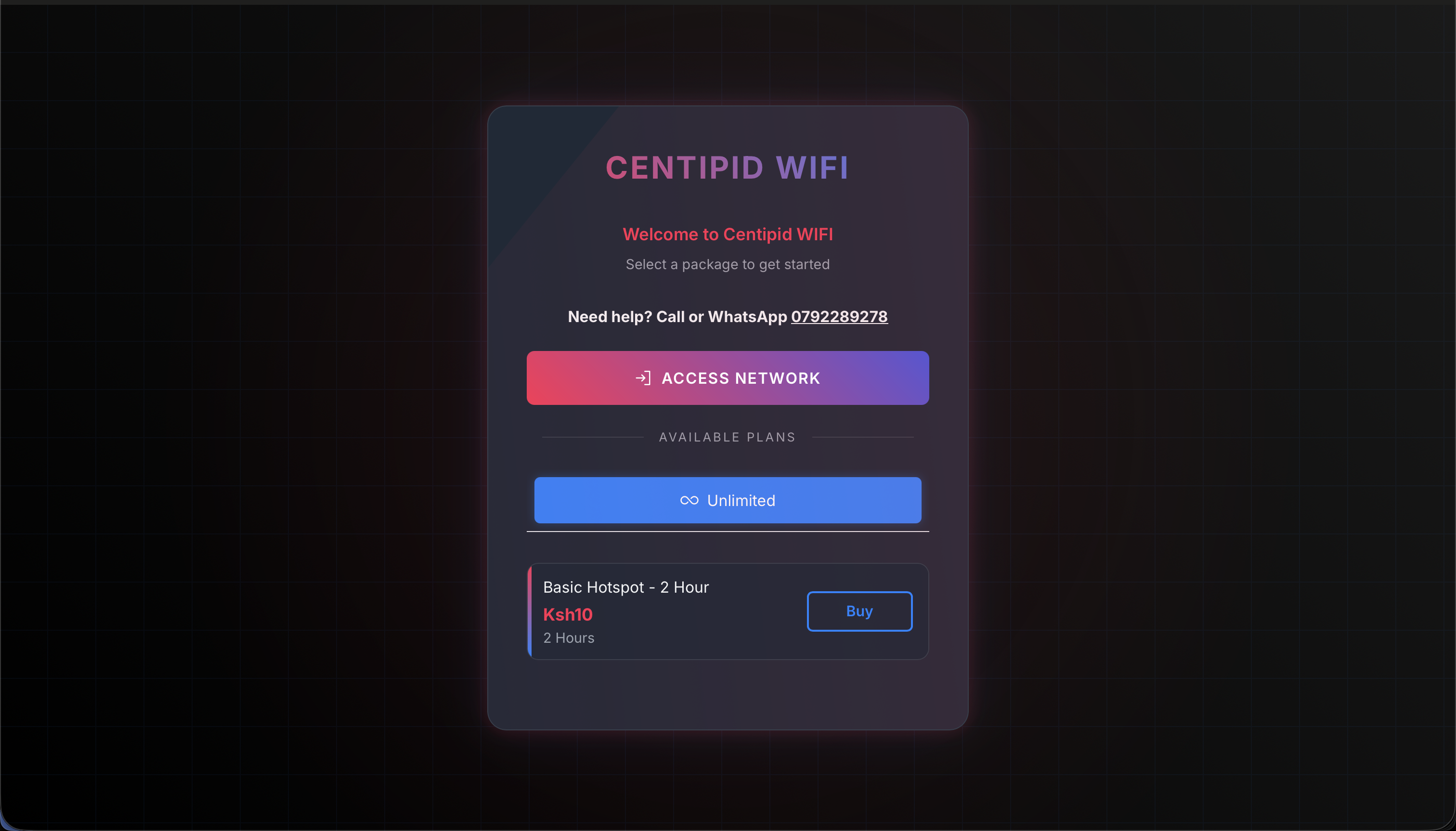
Captive portal templates
All accounts ship with multiple captive-portal themes so you can match your on-site branding without hand-coding HTML. Choose a template from System Settings → Appearance Settings → Captive portal, then customize colors, logos, and support contacts to match your venue.- Languages – Use the Captive Portal Language select to translate your splash page without editing code. Supported options are:
- English
- Swahili
- French
- Arabic
- Portuguese
- Hausa
- Yoruba
- Amharic
- Igbo
- Zulu
- Somali
- Afrikaans
- Default – classic light layout with a hero, headline, and stacked form sections suitable for most deployments. Selecting Default (or Simple) unlocks the Purchase Instructions repeater and the optional Hotspot background uploader for fully guided splash pages.\
- Monochrome – minimal black/white palette focused on typography for a clean splash page.\
- Aurora – gradient-backed hero with large typography and multi-column sections for richer storytelling.\
- Lumen – bright, card-based layout with plenty of whitespace that emphasizes key actions.\
- Lumen Dark – dark-mode variant of Lumen for venues that prefer a darker canvas.\
- Neon – high-contrast layout with glow accents and oversized buttons to highlight the call-to-action.\
- Simple – ultra-lightweight single-column template optimized for low-bandwidth networks or text-first experiences. Selecting Simple (or Default) unlocks the Purchase Instructions repeater so you can describe each checkout step, plus an optional Hotspot background uploader to drop in a hero image.